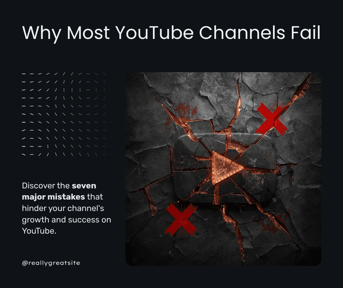
Your thumbnail determines 80 percent of whether your video gets watched. Here are the design principles that make thumbnails irresistible.
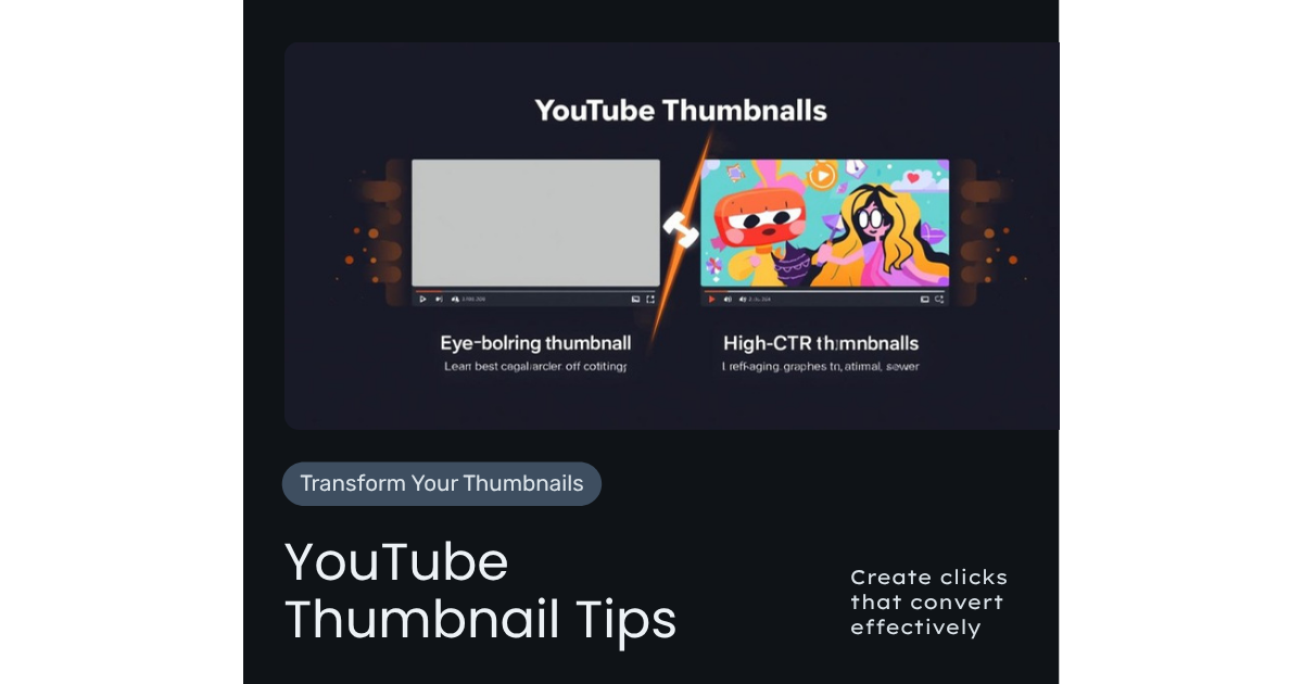
YouTube thumbnail tips can make or break your channel. Your thumbnail is the single most important factor in whether someone clicks your video. According to YouTube's Creator Academy, 90 percent of top-performing videos have custom thumbnails, and the platform explicitly recommends investing in thumbnail quality. I have tested thousands of thumbnails across hundreds of channels through our YouTube strategy services, and the difference between a good thumbnail and a bad one can be 2x to 5x in views.
Here are the YouTube thumbnail tips that consistently produce the highest click-through rates.
The Psychology of Thumbnail Clicks
Before we get into design tactics, understand why people click. There are three psychological triggers that drive thumbnail clicks:
- Curiosity: The viewer wants to know something. Your thumbnail suggests the answer is inside. "Wait, what is that?" is the reaction you want.
- Emotion: Faces showing strong emotions (surprise, excitement, confusion, concern) trigger empathetic curiosity. We are wired to investigate emotional signals.
- Promise: The thumbnail promises a specific outcome. "7 Steps," "Before & After," "The Truth About" — these formats promise concrete value.
The best thumbnails combine two or all three of these triggers. A surprised face (emotion) next to text reading "I was WRONG about this" (curiosity) with a before/after comparison (promise) is nearly irresistible.
Core Design Principles
These YouTube thumbnail tips apply regardless of your niche or style:
Contrast is king. Your thumbnail competes with dozens of others on a results page. High contrast makes yours stand out. Use complementary colors: blue and orange, red and white, yellow and black. Avoid muted tones that blend into YouTube's white interface.
Simplicity wins. If your thumbnail requires more than one second to understand, it is too complex. Limit yourself to one face, one or two text elements, and one background. The postage stamp test: can you understand the thumbnail at 100x56 pixels? If not, simplify.
Text should amplify, not duplicate. Your thumbnail text should work with your title, not repeat it. If your title says "How to Rank Videos on YouTube," your thumbnail might say "Page 1" with an upward arrow. The text and title together tell a more compelling story than either alone.
Faces outperform graphics. According to Backlinko's research, thumbnails featuring faces get significantly higher CTRs than those without. Use a close-up of your face showing emotion. Make eye contact with the camera. Your face is your brand identifier on the platform.
Text Rules for Thumbnails
If you include text on your thumbnails (and you should for most business content), follow these YouTube thumbnail tips:
- 3 to 5 words maximum. Anything more is unreadable at thumbnail size.
- Bold, sans-serif fonts. Thin fonts disappear. Use thick, heavy fonts that are readable at any size.
- High contrast text. White text with a dark outline works on any background. Alternatively, place text on a solid-color block.
- Left-aligned or centered. Text on the right side often gets covered by YouTube's time stamp overlay.
- ALL CAPS for impact. Capital letters are more readable at small sizes and convey urgency.
A/B Testing Your Thumbnails
YouTube now offers thumbnail A/B testing for all creators. Use it. Here is how to test effectively:
- Create 2 to 3 thumbnail variations for each video before publishing
- Change one variable per test: Face vs no face, different colors, different text. If you change everything, you do not know what worked.
- Run the test for at least 7 days before drawing conclusions. Short tests produce unreliable data.
- Track CTR, not views. A higher CTR means the thumbnail is working — views depend on many other factors.
- Apply learnings: When you find what works, make it your template. Consistency builds recognition.
I have seen channels increase their overall CTR by 30 to 50 percent over 90 days through systematic thumbnail testing. The compound effect on views and growth is enormous.
Tools for Creating Professional Thumbnails
You do not need to be a designer to create effective thumbnails. Here are the tools I recommend:
- Canva: Free tier is sufficient. Pre-built YouTube thumbnail templates, easy to customize.
- Photoshop: For more advanced editing. Worth learning if YouTube is a primary marketing channel.
- Remove.bg: Removes backgrounds from photos instantly. Essential for creating face cutouts on custom backgrounds.
- AI image generators: For creating unique backgrounds and elements. Use as supplements to real photos, not replacements.
For my own thumbnails and my clients, I use a template system: a few proven layouts that we customize for each video. This saves time while maintaining quality and brand consistency.
5 Thumbnail Mistakes That Kill Your CTR
Avoid these common YouTube thumbnail mistakes:
- Using video still frames. Auto-generated thumbnails are almost always terrible. Always create custom thumbnails.
- Too much clutter. Every element you add reduces the impact of every other element. Less is more.
- Misleading thumbnails. Clickbait works once. Then viewers stop trusting you. Your thumbnail should accurately represent the video content.
- Inconsistent style. If every thumbnail looks different, viewers cannot recognize your content in their feed. Develop a consistent template.
- Ignoring mobile. Over 70 percent of YouTube views happen on mobile devices. If your thumbnail is not readable on a phone screen, it fails for the majority of your audience. YouTube recommends designing for mobile first.
Building Your Thumbnail Template System
Create three to five thumbnail templates that you rotate:
- Template 1: Face + Text. Close-up face on one side, bold text on the other. Works for opinion and how-to content.
- Template 2: Before/After. Split screen showing transformation. Works for results and case study content.
- Template 3: Listicle. Number prominent, face in corner, category text. Works for "Top 5" and "7 Tips" content.
- Template 4: Comparison. Two elements side by side with "VS" or a question mark. Works for comparison content.
By rotating templates, you maintain visual variety while keeping a consistent brand identity. This approach is part of the content systems I teach in content systems for entrepreneurs and in Crazy Simple YouTube.
YouTube Thumbnail Tips: The Bottom Line
Your YouTube thumbnail tips checklist: strong emotion on face, high contrast colors, 3 to 5 words of text, simple composition, mobile-first design, and systematic A/B testing. Apply these principles consistently and your CTR — and therefore your views, subscribers, and leads — will climb steadily.
If you want a professional review of your thumbnails, grab a free YouTube audit. Or book a strategy call to build a complete thumbnail system for your channel. For YouTube SEO strategies that complement great thumbnails, read my YouTube SEO tips.
Frequently Asked Questions
How much time should I spend on each thumbnail?
15 to 30 minutes per thumbnail is the sweet spot. With a template system, you can create professional thumbnails faster. The investment is worth it — your thumbnail determines whether anyone watches your video.
Should I put my face on every thumbnail?
For personal brand channels, faces in most thumbnails is recommended. However, some content types (listicles, tutorials) can perform well without a face. Test both approaches and let data guide you.
What size should YouTube thumbnails be?
1280x720 pixels with a 16:9 aspect ratio. Keep important elements away from the edges since YouTube sometimes crops thumbnails slightly in different display contexts.
How often should I update old thumbnails?
Review your lowest-CTR videos quarterly and update their thumbnails. An improved thumbnail can revive an underperforming video. YouTube often gives refreshed videos a new round of impressions.
Do thumbnail colors matter for different niches?
Yes. Use colors that contrast with your competition, not match them. If every thumbnail in your niche uses blue, use red or yellow to stand out. The goal is visibility in the search results and suggested video feeds.

Written by
Aaron CuhaAuthor of Crazy Simple YouTube, keynote speaker, and executive coach with 20,000+ hours logged. ICF PCC, NLP Master Practitioner, and DISC Certified. Aaron helps entrepreneurs replace hustle with AI-powered systems that generate leads, content, and revenue on autopilot.